


Transform your data stories with storytelling with data: before and after—coming September 2025
If you're someone who ever has to communicate with data and not sure where to start, you might like to check out this book. I am someone...
Sep 2, 2025


Using ChatGPT to summarize strengths of party based on profiles
There's no easy way getting/ scraping data off the CNA website on candidates for the General Election 2025, so I had to manually copy...
Apr 28, 2025


data.gov.sg API
data.gov.sg has openAPI and for each dataset, it provides a sample Python code to query for the dataset. The output is a JSON and here's...
Aug 22, 2024


Singapore Traffic Updates
Traffic Updates, Road Closures & Road Works in Singapore are published on LTA OneMotoring website. To understand the traffic conditions...
Jul 6, 2024


Interpreting Covid-19 charts
"The numbers have no way of speaking for themselves. We speak for them. We imbue them with meaning." - Nate Silver, The Signal and the...
Jul 24, 2021


Primary School Registration 2021 Data Visualization
This is based on the data made available in ChannelNewsAsia's article on Primary school registration map: Find out how many vacancies are...
Jul 9, 2021
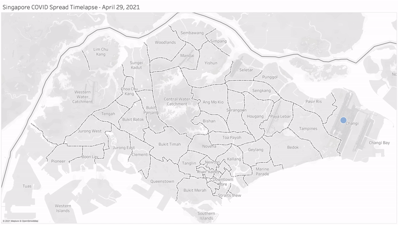
Visualising Covid-19 Spread in Singapore - Announcement
We're doing a sharing on Visualizing Covid-19 Spread in Singapore on 28 Jun, 7pm SGT. Sign up here if you are interested:...
Jun 20, 2021


Year 2020 Safe Management Measures in Singapore - Tableau
Tableau allows easy representation of data in a calendar view. The original dataset I created in Google Sheets contains only four...
Dec 28, 2020


Viz for Social Good APAC Virtual Event - Announcement
Together with two local chapter leaders, Frederic and Thi, we will be hosting the first APAC meetup. If you're curious about the work we...
Sep 25, 2020


Line charts with Matplotlib and Seaborn
It took me really long to figure out how to plot the charts out using matplotlib and seaborn. If you need to use major/ minor ticks,...
May 16, 2020