
Crisis Risk Dashboard - Process - Tableau
- Sep 1, 2018
- 2 min read
Updated: Dec 28, 2020
This is Part I of a two-part post. Part I outlines the process of presenting the data using Tableau and Part II delves into insights from the analysis.
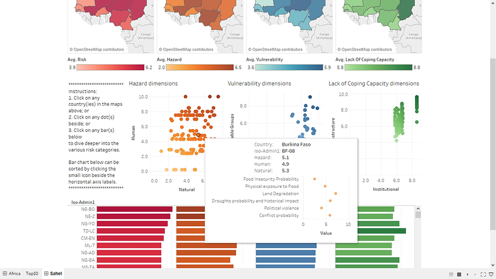
This dashboard was done up for a #VizforSocialGood project. It consists of two sections: (i) violent incidents in Africa across time, and (ii) people most in need of support by different risk categories.


The dashboard hopes to present an easy and effective way to answer questions such as: what is happening? where is it happening? who is involved? who is affected? what has resulted in the current crisis? what continues to fuel the current crisis? what are mitigating actions being taken? how effective are they? where might the crisis of tomorrow emerge?
Capabilities of Tableau:
- Creating maps based on longitude/ latitude automatically.
- Representing number of records for each location with varying color gradient and sizes.
- Allowing playback of years (drag "Year" under Pages).

- Calculating percent difference. Drag "Number of Records" under Measures to Label under Marks and then click dropdown to select Quick Table Calculation > Percent Difference. Color gradient can be modified to show only two stepped colors and to fix center under Advanced settings.


- Enabling interactive actions across worksheets in the dashboard. Click on the worksheet and then click on the funnel that appeared at the side. It will show "Use as Filter". If it's been clicked, hovering over it will show "Don't Use as Filter". Alternatively, select Actions after clicking Dashboard at the top bar and we can choose to add action. The filter actions are generated when the funnel is clicked and thereby auto-populated/ generated. Filtering on one worksheet will reflect the focused selection on other worksheets accordingly.


So clicking a part of the bar charts below will filter the data and show only the selected event type of interest.


For the second section on Sahel, we add the actions without using the funnel option (as above). Hence you don't see the word "(generated)". Filters were applied on some worksheets but not the others, similarly for highlight actions.

Clicking on a dot in the Hazard dimensions chart below highlights the countries in the maps and other points in the Vulnerability dimensions and Lacking of Coping Capacity dimensions charts but filters on the Iso-Admin1 bar chart.

- Identifying top 10 by certain measure, i.e. number of records of political violence in this case. Drag "Country" to Filters and select Top tab.


- Having a visualization in tooltip. i.e. when you hover over the table/ chart, you will see another visualization. This can be done by first creating the chart (as above) and then clicking on Tooltip under Marks to edit and insert the Sheet.


Alternatively, the interactive dashboard can be viewed and downloaded here.
The data used can be found here. Below is a preview of how the datasets looked like.
ACLED: incidents of political violence - Each row represents one incident of political violence - Each column is labeled. Key columns include location (including lat-lon), date, type of incident, number of fatalities.

INFORM (subnational, Sahel) - Each row represents a particular region in a Sahel country - Each column represents different types of risks and the corresponding risk rating (suggest pivoting the table resulting in columns: country, admin 1, ISO3, ISO-ADMIN1, indicator, and risk rating)


Comments