
Vulnerable Groups in Palestine - Process - Tableau
- Apr 8, 2018
- 2 min read
Updated: Dec 28, 2020
This is Part I of a two-part post. Part I outlines the process of presenting the data using Tableau and Part II delves into insights from the analysis.
This dashboard (consisting of 5 tabs: Main, Elderly, Persons with disabilities, Children in labor, Adolescent Girls) was done up for a #VizforSocialGood project.


Capabilities of Tableau:
- Making use of Dashboard> Actions... to jump from one dashboard to another. For this visualization, I included these actions:
Jump to Elderly dashboard when the "Elderly" tab on Main dashboard is clicked (similarly for "Persons with disabilities", "Child in labor", "Adolescent Girls").
Go to previous dashboard when "Previous" arrow button is clicked and next dashboard when "Next" arrow button is clicked on the individual dashboards ("Elderly, ""Persons with disabilities", "Child in labor", and "Adolescent Girls").
The rest of the dashboards have to be completed first before we can perform the link between dashboards to enable the transition from one dashboard to another upon click.
So firstly, I need to create a Main dashboard with various tabs. To do up the tab, I create a calculated field (Caption) that contains the tab name eg. "Elderly"and another calculated field (Blank) that's empty i.e. "" and then drag them to the worksheet as follows. The default text abc on the worksheet will then be gone. Add more worksheets and do this for the other tab names. The color of the tab (or worksheet)/ font can also be changed.


Next, we have to create the "Previous" and "Next" arrow buttons. Similar create one worksheet for each button. Right click on the header to hide it. There is a slight difference between the "Previous" and "Next" layout. In the dashboard, the word "Previous" is added using the Textbox. The title of the worksheet can be used to indicate the direction and tab numbers for clarity.


Now, we can finally add all the actions for transition from one dashboard to another. At the dashboard view, select Actions... from Dashboard dropdown. Eventually, there should be 10 filters created. Click Add Action> Filter to start creating the actions.

This action allows the user to view the "Persons with disabilities" dashboard after clicking on the "Persons with disabilities" tab on the Main dashboard.

This action allows the user to view the next dashboard after the "Elderly" dashboard, i.e. "Persons with disabilities".

This action allows the user to view the next dashboard before the "Child in labor" dashboard, i.e. "Persons with disabilities".

- View Grand Total. This is useful when you would like to look at things at a more aggregated level where it looks at the entire picture overall (as compared to looking at the distribution specific to certain areas, in this case).


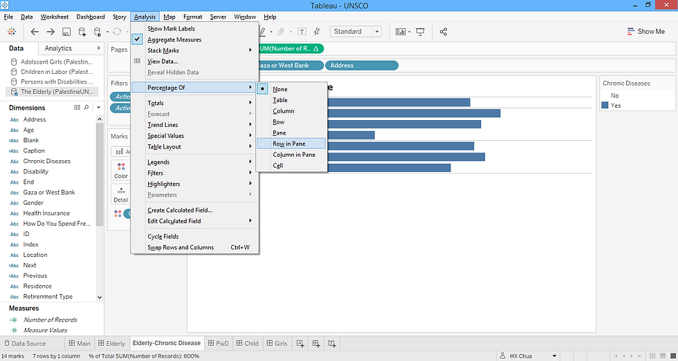
- Show values in bar chart. To view percentages, select Percentage Of > Row in Pane under Analysis dropdown. Format the axis to the right number format you would like it to be then right click on the bar to add on the value. You can hide the X-axis label thereafter.


Alternatively, the interactive Tableau dashboard can be viewed here.
[/Edit - Updated on May 10, Jun 25] Happy that this visualization was selected to be featured in the UN Development Group's silofighters blog. Minor edits were made to the original visualization taking in comments from the committee.
Reference:
Comments