
Analyzing train travel times and fares in Singapore
- Nov 5, 2018
- 4 min read
Updated: Dec 28, 2020
I set out to try to understand the accessibility of different train stations in Singapore and how travel times and fares vary by stations. The purpose of the analysis is to identify areas that are more convenient, based on train as the sole mode of transport. There are many ways to do the analysis:
- Looking at the number of stations reachable within X mins
- Looking at the range/ distribution of travel times
- Looking at the range/ distribution of travel fares
I placed equal weights on each station, i.e. each station is as important as another. This might not be realistic as some locations are not as frequently accessed as the rest. However, this is a good starting point and a general approach. I have also focused more on using travel times as the basis for comparison instead of travel fares as fares are going to change 29 Dec 2018. It is also important to note that the travel times here do not include waiting and transfer times, nor delays. This might not be trivial but I'm assuming an equal probability of occurrence for each station which is probably not true. There is a need to analyze the probability of delay events before we can build in this prior, of which, I do not have this data at the moment. How I collected the travel time and fare data can be found in a previous post.
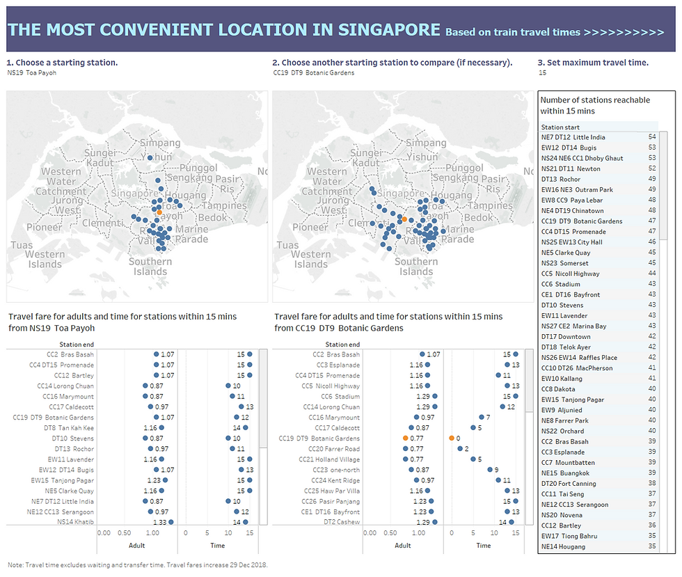
So, I did a dashboard for users to compare the reach from a particular station with another within a certain time limit to help suggest possible meeting points through overlapping regions. The interactive dashboard can be accessed here. It is interesting to note that Little India has the most number of stations reachable within 15 mins. For the most number of stations reachable within 8 to 18 mins, the top 3 stations are Dhoby Ghaut, Bugis and Little India. Serangoon became the top station with most number of reachable stations within 19 mins. This could help in the planning of a property purchase, as convenience is a major consideration. It would also be interesting to correlate this accessibility with property prices.
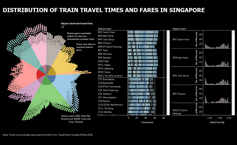
I did a second dashboard to present a macro- and micro-level view of the distributions of travel times and fares. There seemed to be a trend towards fancy visualizations and I don't quite endorse that. Most of the time, simple charts such as bar charts, line graphs or scatterplots would be able to present findings effectively. Nonetheless I decided to give radial charts a go. If you look at it, it is really only useful if we're interested in looking at the big picture, instead of relying on it for statistics or numbers. We can see the overall spread of travel times for different train lines, indicated by the different colors (I have grouped some together eg. SW and SE, PW and PE, CE and CG). Also, we can tell that the BP line (indicated by grey) has the least number of stations followed by the NE line (indicated by purple). Further, the stations on SW/ SE line (indicated by pink) and PW/ PE line (indicated by teal) have a pretty similar distribution of travel times, while the EW line (indicated by green) has the greatest variance, where the spread looked like a heart-shaped figure. A more homogeneous spread would resemble a triangle shape, more similar to the BP line (indicated by grey). Through adjusting the maximum travel time, I found ALL stations on the CC line (indicated by yellow) being able to reach all other stations within 62 mins. Again, there are many limitations of such a chart. It's not obvious how many (or proportion of) stations can be reached within 15 mins, and it's hard to filter on a particular station to look at. Hence it really depends on one's objectives to be achieved when designing visualizations.
Moving on from the radial chart, the two charts beside provide a granular breakdown on the travel times and fares station by station. It is easier to see the distribution for each line and each station. The distributions of the travel fares are pretty interesting; each has a distinct shape, and they are especially different across different lines. The fares are definitely not normally distributed and hence computing travel fares on average for someone traveling from a particular station might not be meaningful. It would be useful to study how much a person staying in each region is spending on train travel and perhaps this could better influence the design of different tiers of welfare packages in supplementing transportation costs. Of course, there are many ways to do this, either through a cap or a percent discount on each ride; in terms of implementation, this will probably have to be tied to an identifiable card. The interactive dashboard for the below can be found here.
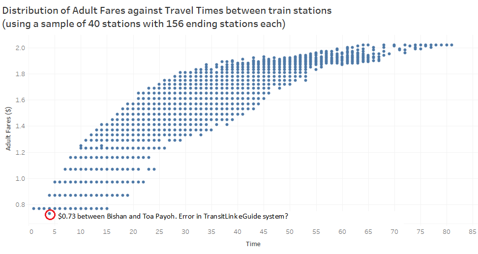
Separately, before I finished collecting data on all 157 stations, I decided to do a preliminary analysis on the distributions after collecting data on 40 stations. Boxplots are very useful in assessing range/ distribution where the median is more robust to outliers and hence making comparisons more meaningful. It is also easy to see which stations have lower median travel times and fares than the others. Again, this is based on the assumption of equal importance of each station. Should we place higher weightings on certain stations, the distributions will change.


On the other hand, scatterplots are useful to help us understand general trends and also in identifying outliers (and possible data entry errors?). We can see a logarithm relationship with a plateau effect. There is definitely a potential to study the impact of different pricing strategies on revenue, such as a stepped increase or a time-based instead of distance-based fee structure. This would make fare estimation easier but also I think this would translate to higher costs for commuters.
This post was also published in Towards Data Science on Medium.
Comments